Saturday 27 August 2011

Just add water!

I've been intrigued by Derwent's new Inktense products, so today I bought some to see how they handle. Originally intending to buy the 24 block set, this proved to be sold out so I bought the 6 pencil blister pack (red, yellow, green, blue, violet and black) and 3 blocks in sea blue, indigo and bark (sepia). I also got the grippers as handling them in the shop I could see they were readily staining my fingers.

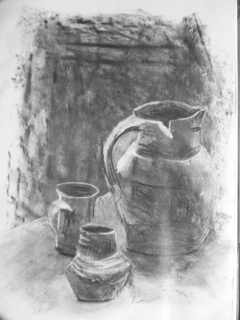
On the way home I stopped at the farm shop and discovered a big basket of squashes, which seemed perfect for a trial subject, and once back in the studio I arranged them with an old wicker market pannier on a table. I didn't have any hessian but draped a sheet over the surface to give some background interest.


I fixed up a sheet of A1 cartridge paper on the easel and used the sepia coloured block to make the initial drawing. I found I needed two grippers on the block otherwise the exposed end was really staining my palm. They have an interesting texture, not quite waxy, slightly like a chinagraph pencil but less sticky, and I needed to go over lines to bring up the tone at the drawing stage.


Next I started to wash over the marks with a large watercolour brush. At this point I discovered how intense the pigment actually is, and in future I'll be using it a lot more sparingly in each layer.


I achieved the basket weave by broad downward strokes followed by horizontal lines in between with a round brush- I quite liked the result and didn't want to make it too fussy.

Next I got to put some colour in. By now aware of how strong the pigment was, I applied it much more thinly, and although only using red, yellow and green for most of the fruit- with a touch of blue on the pale green pumpkin- found it made a nice range of orangey-reds and greens. The brush does pick up a lot of pigment though, and needs to be cleaned almost every stroke to avoid muddy mixing. Another point to note is that any undissolved pigment from a layer will of course disolve when working on the second, which is not always desirable. I found that I could sufficiently erase left-over areas with a plastic eraser to remove the unwanted colour.


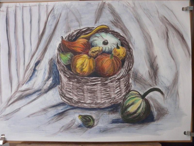
Another thing I found was that the drying time was surprisingly quick, so on larger areas you don't have much time to get an even layer of water without using too much. I work with acrylic paint, which I think was a bonus, as unlike watercolour Inktense is permanent once dry. I found that a layer of indigo over the original sepia produced a wonderfully vibrant almost-black in the shadows between the fruit.

Having got to this stage I now needed to decide how to crop the image, as there was far too much background, and eventually, after much laying of sheets of paper over parts of the page, went for a square approximately 50cm each way.


Having altered the format of the picture plane I spent some time looking at where I needed to do more, including looking at it in the mirror. I decided I needed a little more in the way of shadows to ground the basket onto the surface, so I added more indigo to the top left edge and defined the right side of the basket. I pulled this area past and below the stalk of the foreground squash to tie it in to the composition. The final version is below.


I really enjoyed using these, finding it a nice halfway point between drawing and painting. Some of the darker colours look very black when drawn on the surface, and adding water reminds me of the magic painting books we used to have as children. I'll certainly be investing in more, I especially like the permanent nature of the dissolved pigment, and it can be overworked with just about any media which makes the possibilities almost endless.

Inktense are also recommended for use on silk, and I'm curious to find out how well they'll work, especially as I used to find colours dulled when fixing with an iron, and these are permanent when dry, so I'm hoping for vibrant results. Now I just need to find where my silk and stretcher frames are...I'll let you know how I get on.

Saturday 20 August 2011

Loosening up with Squash and Leeks

After spending two days working in very controlled media I needed to work in a much looser way to prevent my work getting "tight". I arranged a couple of squashes in various positions and at different heights. I abandoned the marrow early on but would have preferred to have three or even five squashes to play with- I might buy some more next shopping trip. With only two items there were a limited number of arrangements possible, and I decided that the best approach would be to show an interesting cast shadow and reflected light.


I worked in Copic marker on bleedproof A3 paper, selecting a square frame to best fit the subject. As marker ink takes a few minutes to dry I needed to add some adjustments to the shadows after I had reached what I considered to be a finished stage. In my sketchbook thumbnail I had used a graduation in the background to contrast with the light and dark edges of the fruit, however having laid in the overall blue-violet colour I found it had the right hue and tone without further layers.


I also felt that I had achieved a quite painterly effect with the layered strokes of ink. While I initially struggled with these permanent markers I'm finding I use them increasingly, although they do bleed alarmingly through cartridge paper and I now use a sheet of acetate under the sketchbook page to prevent other pages being stained- a device which has also proved useful to prevent transfer of soft pencil and graphite marks between pages- the acetate doesn't pick up residue, is thick enough to withstand a fair amount of pencil pressure, and can also be used to rest my hand on on the surface where it doesn't block part of the drawing from view which a scrap piece of paper would.

I then changed to ordinary water-soluble markers and did a quick study of some leeks- time was going on and they were destined for our dinner, so I wanted to draw them at least once. I used an olive and a gray-blue colour, the olive was nearly running out which gave some interesting results in the shading!


I liked the overlapping shapes and was sorry I didn't have enough time to do more work with them, this five minute sketch was all I could manage.

Tutti Frutti textures

I jumped slightly ahead in the coursework in order to do this still life with a range of interesting fruit, due mainly because I have limited time to work usually and I know working with coloured pencil is time-consuming. For the same reason I didn't spend time drawing thumbnails but made the compositional decisions quickly in my head- which did eventually lead to areas which didn't work effectively.


The piece took about eight hours in total because of the need to build up colour in layers. While I was pleased with the overall result, there are some noticeable issues.

The backgound was too bland so I drew in the shape of the kitchen hatch behind, only to realise that closed doors would seriously affect the lighting, so converted them to a window, which should have had much stronger tonal contrast with the bright light. The wall also needed to be darker, especially under the window and to define the edge of the table. Also the piece of ginger has a shadow thrown by the watermelon across it which has got rather lost as I struggled to blend a convincing overall colour on the surface. There is quite a lot of white still visible in the shadow- the cartridge paper I used has a more pronounced surface than my usual choice and without blending or stumping the entire area I couldn't get the pigment far enough into the paper, and I chose not to stump as I felt it would become rather flat and overworked.

I felt the more sucessful areas were the highlight on the watermelon and the texture of the Galia melon- for this I used a series of random marks in two tones to suggest rather than define the cracked surface. I alo felt that the pink grapefruit flesh was moderately successful in indicating the juicy cut surface although I would have liked to retain more small sharp highlights where the light glinted across the surface.

Hocus Pocus

For this exercise I wanted to try and group a more coherent theme using my favourite glass bottle, and after an hour of ransacking the house for long-lost items put together a collection loosely based on a Magikal theme. I couldn't find an old book until my husband trawled up a wonderful early Victorian album of his grandmothers.


I started with a fairly conventional viewpoint and played around adding and taking away various items (1). On the second study, as my objects had fallen off the edge, I briefly played with the potential of doing this deliberately, with the vague concept of reaching through the veil between the worlds (2). I took a much higher viewpoint which put the composition into a triangular frame, which I really liked, although the pestle and mortar didn't seem to fit (3).

In the interests of experimentation I fetched a besom and a long scarf of a similar blue to the bottle to try and elongate the picture frame(4). I thought this had possibilities but I was working in a limited area in the window. I had one hook above from which to suspend the scarf (there is no curtain rail in here) and the besom had to be wedged awkwardly and appeared to be too large an item. Rearranging the objects tended to block any light from the crystal ball which I felt should be a main focus of the composition.


I added a glass goblet and tried another sketch (5), but returning to a more ordinary viewpoint was not very satisfying after the dynamic ones I'd been developing. I decided that the third, triangular one had the best potential for further work but used the goblet rather than the pestle. My final sketch was to put the objects and the triangle against a dark background to see how that could affect their appearance.

I really enjoyed working with this subject, having loads of ideas. I have quite a definite idea about how I want a final piece to look, with low lighting and highlights describing the shapes, in the style of some of the Old Master still lives, but it is clear that I have some technical lighting issues to sort out first and probably need to set the arrangement up in a space with controlled lighting conditions. I would also like to develop a second, more abstract approach in a more graphic style, and at present not entirely sure whether either will be drawings or paintings.

However, having decided on the group, I'm in the process of enlarging the outlines onto an A1 working cartoon to allow further consideration once faced with the larger scale.

Izzy Whizzy let's get busy...

Wednesday 17 August 2011

Studies on coloured backgrounds

After the trials of Saturday, I decided to take a fresh approach and play around in the negative- i.e. drawing light onto dark. Originally I intended to work on black paper but realised that I could make the background colour work for me on the tomatoes so selected the most vivid red I had. I started working with a normal kid's quality white crayon and soon realised it didn't have the pigment level to produce results- a salutory lesson in choosing suitable tools! I swopped over to my Caran d'Ache set, using only white, pastel yellow, and grey-blue for the shadows, and two tones of olive for the stalks. I liked the graphic quality of the finished study.


Pleased with this attempt, I then turned to the aubergines, which I decided to put on a black plate to really force me to describe them with highlights. This time I did use my black sketchbook as I couldn't find a suitable aubergine starting colour, and probably a greater number of colours as I was cross-hatching and blending in places.


Lots more veg to work through yet, so don't go away!!

A bad day for Ratatouille...

I'm off work this week so am trying to have a major push on coursework. Last Saturday I dashed to the shops and selected the week's fruit and veg on the basis of how interesting it was to draw, came home and immediately set up a collection of veg to work on.

Pretty soon I realised it was not going to be a good day. I couldn't get comfortable, moved the easel position several times, and squinted in vain to see why the left hand side of my study didn't match up. The first failed attempt is above- I decided I had put too much in so removed a few things and tried again.


As you can see I got even less far with this attempt, again due to an inability to reconcile the respective placement of the foreshortened aubergine, garlic and knife handle. My husband intervened at this point to forcibly remove me from the studio (the air had taken on a blue tone) and feed me with bacon sarnies and coffee, at which point I realised that with the sheer amount of hours I'd been working, I should have really taken the weekend off for some R&R before diving in.

However, as I needed some of the veg for dinner, I had to dive back in later, so chose to use my favourite charcoal and eraser technique in an attempt to get past the block.


It's not perfect and I was grateful for some candid feedback from a co-student after I posted it on the forums, but at least I felt I had beaten the jinx.

Valid points raised were errors in the shadows, not defining the back edge of the board, and the enormous negative space left at the top- which I would have trimmed off when mounting. Also I still had a diagonal void between the upper left and lower right halves; the tomatoes intersected with the tip of the marrow and were higher up the board (which is why I hadn't seen the back of the board).

However, even bad things can be learnt from and as this is the first really low point I've hit on the course it probably shows I have a good level of motivation- I'm certainly not going to be beaten by a few pesky veg!


Sunday 7 August 2011

Patrick Caulfield -positive and negative space

PATRICK CAULFIELD (1936-2005)

Patrick Caulfield was a painter and printmaker known for his Pop Art canvasses, and was a contemporary of David Hockney and Allen Jones.

For many years I had a postcard of Pottery (1969) without ever finding out more about the artist, but I always liked the strong colours and at the time was working on ‘O’ level screenprints and lino cuts using a similar linear style.

There are many images of his work on the Tate website and it took me over an hour to browse through them in order to get a feel for his work. I particularly liked the breathtaking simplicity of Bathroom mirror (1968) .
Many of his pieces are screenprints, and the same image or element may be used in several ways and with different colour choices, but a large body of these are characterised by bold outlines and flat, saturated colour.

Later in his work he combined the strong linear graphic with areas of photorealism, as in After Lunch (1975) .

In certain works he breaks the tonal areas down to a minimum, typically using black, white and a third colour, and these are best seen in his series known as the “White Ware” prints (1990) of which all eight images are listed below. The links go to the Tate website images.


The strong contrast of tone is carefully balanced into positive and negative areas, with the focus being on the white areas describing the vase and the light source. The odd one out here is Large White Jug, as the backlit shape appears solid white with only the shadow thrown by the handle to describe it.

EXERCISE IN POSITIVE AND NEGATIVE SPACE IN THE STYLE OF CAULFIELD

My brief is to produce a drawing in a similar style, and as the need to define clear tonal areas calls for a drawing with plenty of contrast, I’ve selected a still life study I did some months ago to develop.


The first process was to define the shape of the light and dark areas and to decide what elements to include. I opted to use the jug and pot and leave out the china mug which seemed a bit too clean lined for inclusion. I used the marks on the background (pentimenta from old masking tape under the paper) to suggest a door which helped break up the large area of negative space in the background.


I started by making a line drawing of the basic shapes through tracing paper from the original- it helped me to see the likely dividing lines between tones more easily. After I had familiarised myself with the shapes I moved on to developing a series of thumbnails in my sketchbook, using 4B and 9B pencils to give two distinct tones. The 9B has caused some light-bounce in the photograph.


Of the second two studies, I first completed a negative version to compare the relative balance of tones. I’ve learned to do this when painting- a quick black and white photograph can highlight areas with insufficient contrast and can easily be flipped into negative for an alternate view.


My first tonal sketch seemed to have too much white so I reworked it and made the table a mid-tone as well. While I was working on these I realised how dependent the image was on complete accuracy of tonal shape in order to make it readable, as I had now lost most of the linear information from the drawing. Details such as the lip of the jug and a tiny curl of light around the base became crucial to get right.

Finally I did two more versions, one in marker pen and a colour version in sepia and sanguine Indian ink. The inks bled slightly on the cartridge paper so they are not as crisp as I would like, I will have to repeat the exercise on marker pad for a clean finish.


I was rather surprised that I succeeded in producing an end drawing from this project as I was more drawn to Caulfield’s earlier linear style and could immediately see applications for it from sketches I have in development. The White Ware series was in complete contrast and I took a long time to find a way in- I’ve been working periodically on this project for nearly a month, and up to last week was still reading other student blogs to see how they had approached it.

It’s been interesting to focus on the extreme contrast of tone. The White Ware prints tend to have two relatively dark tones and the contrast of the white areas gives them a very intimate focus. Their elegant simplicity has echoes of Yin and Yang and complements the subject matter- seven of the series are titled for the Chinese pottery which is their focal point.

(10th Aug) I've now completed a final version of the still life, in marker pen. I chose a slate purple colour to echo the desaturated reds and browns which Caulfield often uses in his backgrounds as I didn't have a suitable brown.

Time to put Caulfield to bed for the time being and progress to the next exercise, although I'll be using what I have discovered in other work of his to develop other pieces.


Eric Ravilious 1903-1942

ERIC RAVILIOUS 1903-1942

Biographical notes

Ravilious began his career as a muralist, not becoming known as an artist until 1924, and going on to become one of the best known of the 1930s. He also worked as a lithographer and printer.

He was especially inspired by the landscape of the South Downs and their chalk figures, and his stippled watercolours are prized for their otherworldly quality.

His woodcut of two gentlemen cricketers has appeared on the cover of every Wisden Cricketer’s Almanack since 1938, and he also designed for Wedgewood and London Transport, among others.

In the war years he became an official war artist which was ultimately the cause of his death while accompanying an RAF air-sea rescue mission off Iceland.


His work

Having searched for a variety of Ravilious’ work on the internet, I realised I was not familiar with any of it, although the style echoed other work of the 30s and 40s especially where designed for printing, as in book-jacket illustrations and transport posters.

The wood cuts I looked at are on the whole intended for bookplates or vignettes and have a rather stilted feeling to them, although it was interesting to see how he used line width and cross-hatching to develop tone, remembering of course that each carved line becomes a highlight when the print is taken.

His style irrespective of medium tends to be somewhat graphic. No doubt his experience in the print industry influenced the use of line and shape, as there is often a strong design element in the composition of his landscapes, and I am reminded of Susan William-Ellis’ “Tudwal Lighthouse” reworked to become the cover illustration for “Portraits of Islands” in 1953. (Magic Gardens, Portmerion Ltd 2008, p24-5)

My initial impression of his Downs landscapes was of strong verticals and horizontals balanced by sinuous curves. Colours tend to be muted and of limited hues with occasional accent colours.

These sinuous curves sometimes appear not quite “right”, which reinforces the perception of his work as otherworldly. It is particularly well used on two of his landscapes with chalk figures.

Some of his wartime images, particularly of planes and submarines, show strong graphically abstract elements where the shape of a wing or partial hull is pinned to the edge of the picture plane in an interesting precursor of Roger Hilton’s work from the early 1950s.

His The Greenhouse: cyclamen and tomatoes (1935) with its numinous upward arrow of light describing the receding space, could at first glance be the prototype shape for Gormley’s “Angel of the North”, and the quality of light achieved in this picture is similar to Naum Gabo’s ambitions when he worked on his Perspex spacial sculptures in 1938-40.

It was interesting to find studies which were later used for final works as it allowed a glimpse of his workflow. Using pencil first, colour is then layered up, often with watercolour and at other times cross-hatching with pastel and crayon.  From the Isle of May looking to the Forth Bridge (c1940-1) (scroll down for verso image) shows how colours were developed in layers of carefully applied strokes to accentuate the wake of the boat and movement of water.

The work which most stood out for me was Submarines in Dry Dock (1940)  which uses pencil, watercolour, crayon and pastel and most strongly shows the effects possible with linear media in describing the textures on the scaffolding and the shapes of the submarines. The submarine studies appear in an earlier montage piece but are here grounded among a cradle of scaffolding. Once again there is one element which is slightly “wrong”- in this case the top profile of the right hand sub, which curves down despite being above eye-level. One wonders whether Ravilious used this deliberately in order to accentuate the somewhat alien shape to his audience.

Interesting things at a farm sale

A chance comment from a friend last night had us rearrange our day to go to a farm sale, which as promised had loads of interesting lots regimented across a grassy  field. I was quite happy to pull out sketchbook and pencil while Mike went off to nosy through the miscellaneous boxes and snoop around the Fordson tractors. My stab at drawing the tractor shows I still need practice- not that I don't see enough of them each day at work!


Next I spotted the old diesel cans (top left) without actually knowing what they were at that point. The challenge here was that people were still going around looking at the lots, standing in my way and picking them up/moving them. In addition a large cloud was looming and every so often I would lose the light/dark contrast.

I moved on and found a great big box of forging tools, of which I drew the three bottom left. Stupidly I had deliberately left the camera in the car so I would be forced to draw, otherwise I would have liked a reference shot of the whole box- a great subject for an abstraction or a print at a later date. A farmer stopped and commented on my drawings- usually I'm quite self-concious but took it in my stride and we discussed old farm implements and tools for a brief spell.

Soon after I spotted the milk churns, and just had to draw them as they are the sort of  useful "furniture" to include in a rural landscape, and you see so few these days outside of farm museums which are generally poorly lit, these gave me the opportunity to record them in a natural outdoor setting. I note I'm still not brilliant at getting my ellipses right though!

I was starting to really enjoy myself now and returned to a box of gears I'd seen earlier- actually it may have been a whole gearbox in pieces.


I didn't get the foreshortened axle correct (people moved the piece twice while I was drawing and I may have sidestepped which changed my viewpoint slightly) but I was concentrating on the wonderful intricacy of the cog wheels and the shadow shapes made by their lugs- there are similar shapes to be found at Geevor and I feel I want to create a whole composition from them.

I finally located my husband in the crowd and returned to the car for a drink of water, also to take a few distance shots on the camera of the crowd around the auctioneer as the bidding was well underway. It started to rain at this point so I sat in the car and did a few thumbnails of people talking away from the main crowd, remembering to focus on the shadows and lights as I get completely lost if I try to apply the rules of anatomical proportions. I included a pigsty and a cart as a scale reference.


It was a useful excercise, especially the man bending down, and certainly an improvement on previous attempts.

After spending some time in the crowd as the tractor lots came round, I found an old fuel tank with a beautiful glass top and started to draw it. Once again someone stopped to comment.


 I only completed the top section as rain was again threatening and we decided to head home at that point.

I'm finding that I'm going to quite different places to find interesting things to draw, I would never have taken a sketchbook to a farm sale before, but it proved to be a good place to work in the open as most people were there for the sale and not especially interested in what I was doing. It also proved to be a good source of accessories, as with the milk churns, which can be used in compositions later on. Also, it focussed the mind on getting the drawings done, as once a lot was sold they were quickly being collected, so there was some uncertainty as to how long I had.

Oh, and as a bonus, my favourite charity shop later yielded two old Sotheby's art sale catalogues with some great Impressionist and modern (Picasso, Miro, Ernst, Kandinsky) colour plates for less than a fiver! Plus I've finally managed to file all my loose-leaf coursework into binders, so quite a productive day all round!

Friday 5 August 2011

Slow Progress

My day job seems to be taking up far too many hours at the moment and although I'm still just managing to squeeze the minimum eight hours work on the course in each week I'm finding it incredibly difficult to keep a sense of continuity going. Also, having read a number of forum posts relating to sketchbooks, logs and assessment presentation, I realised I had to get to grips -earlier rather than later- with a system of cross-referencing which works for me and will hopefully make sense to tutor and assessment board alike.

As my previous experience has been with various NVQ related courses, I'm used to having to relate evidence to a particular point on the evidence matrix, so earlier this week I worked through the entire first assignment and mapped it out as a series of exercises (I defined 31 including the research points and the check & log stages) before reaching the final assessed project. This works for me as I now have a definite structure to record where I have got to on the course, and whether I have sufficient supporting evidence for each stage. I choose to aim for a minimum of three pieces which support each stage, and each will be numbered and cross-referenced to my breakdown of the learning objectives.

What has already become clear is that I have not yet got into the habit of a) keeping a sketchbook regularly (I haven't up to now used one more than occasionally- I only produced six in 2 years of A level- and not many more in the 20 yrs+ since) and b) while I am producing finished studies I'm not writing down what my thoughts and feelings are to the extent that I probably should- not entirely sure how I would do this...

There are also a few other points on the forums that I have rather strong feelings about. I have never used a sketchbook as other than a collection of drawings/paintings. It would not occur to me to stick pictures and postcards into it as I am not a scrapbooker- my postcards are kept in a bundle in a filing box, and pictures I like are either saved online or ripped from magazines and eventually collected into a folder, with a few getting mislaid along the way. Drawings on loose bits of paper stay loose- if I work on pastel paper, for instance, I pull the selected piece from the pad and it stays loose. Think I'm going to have to organise a ringbinder for those.

 I'm also against using one sketchbook for everything, I prefer to keep one per theme, so at the present moment I have one solely for Geevor Mine, one for Assignment 1 stuff (it has a few random pages in the front as I already had it) one for still life work (its a square format and I like working with squares), one for landscapes and one for life drawing. I do have a pocket size one which occasionally I have opportunity to use at work- I carry a small item with me in case I get a spare half hour, such as a broken shell or pine cone, together with a pencil and drawing pen.

 I select up to 2 sketchbooks to take out with me (weight factor) depending where I'm going and also usually have a folder with some coloured pastel paper with me. I'm conscious of the fact that if I have to send a book for assessment I will not have it for a fair while and that is a very alien concept to me, even though I am now photographing each page as it comes about.

The biggest struggle I have is drawing "lots of 5cm squares" and filling them in with whatever is asked. The squares are not the problem- I usually dry up on ideas by #3! (Maybe I should try circles?) I do know that I need to do some back-tracking here and get them pesky squares filled in!

Anyway I'm counting down next week till I have a week off so hopefully I will get the creative flow going and do some serious catch-up on coursework...